Revenue Dashboard: What to Actually Track

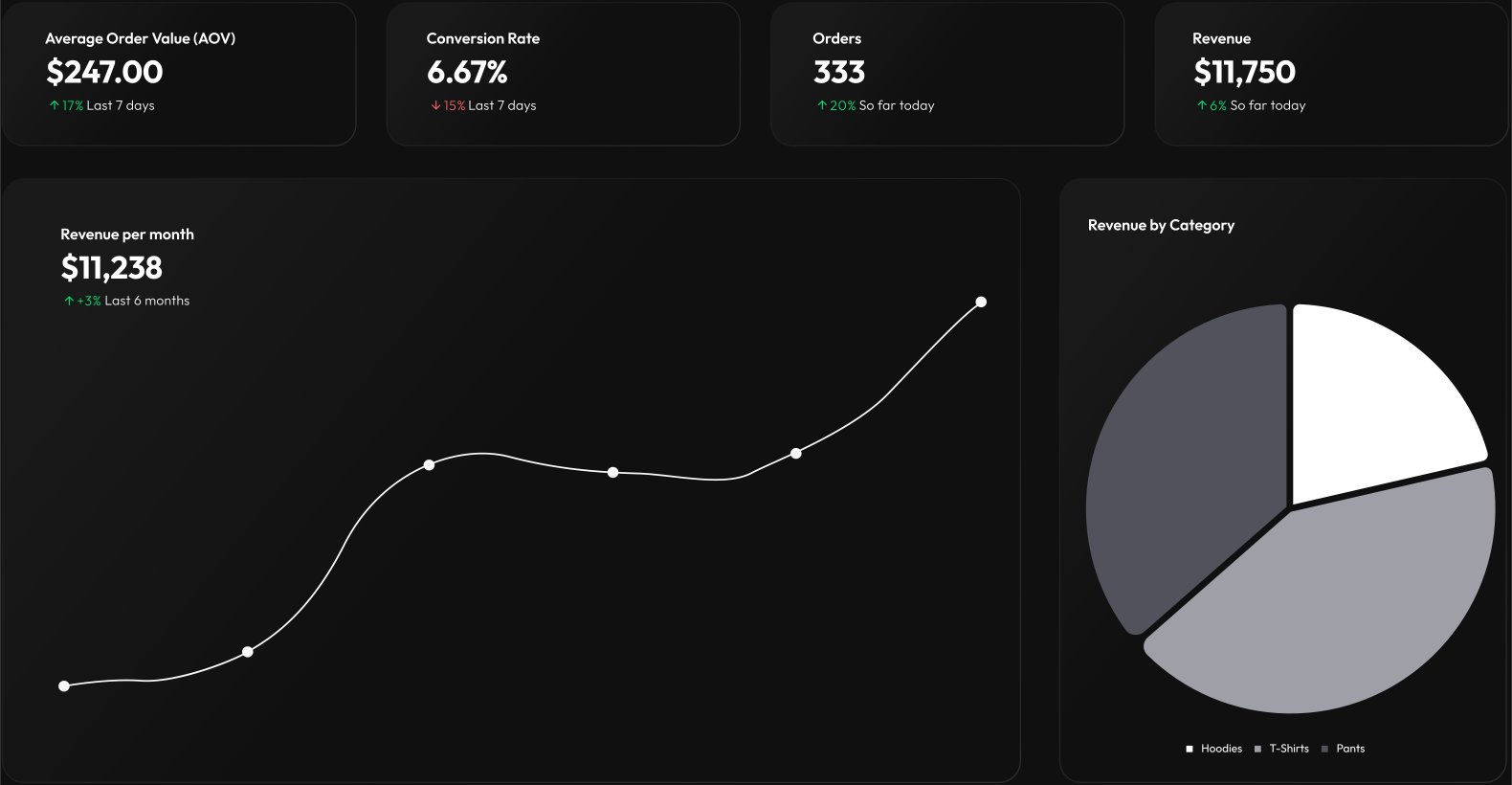
A revenue dashboard layout with MRR, movement, retention and top customer widgets.

A revenue dashboard is the board someone opens first thing in the morning and again before a board call. It has to answer one question in about four seconds: is revenue doing what we expected, and if not, which part moved?

Most revenue dashboards fail that test — not because the data is wrong, but because they show cumulative totals that can only go up. A number that cannot fall carries no information. Nobody has ever changed a decision because lifetime revenue rose again.

So the hard part of a revenue dashboard isn't wiring it. It's choosing what goes on it.

What belongs on a revenue dashboard?

Six metrics, and a reason for each. If a number here can't change what you'd do tomorrow, it doesn't belong.

  • MRR — monthly recurring revenue. The headline. Normalise every plan to a monthly figure first: an annual subscription is not twelve months of revenue in the month it was paid. Put a goal on it if you have one; a number against a target reads faster than a number alone.

  • MRR movement — new, expansion, contraction, churned. This is the metric that actually earns the dashboard. MRR up 3% means nothing on its own: it could be strong new sales, or it could be one big expansion masking steady churn underneath. Splitting the movement into its four components tells you which, and they call for completely different responses.

  • Net revenue retention. What last year's cohort is worth today, expansion included. Above 100% means the existing base grows without a single new customer — the difference between a business that compounds and one that has to re-sell itself every month. It is the number an investor asks for first, and the one most teams can't produce on demand.

  • ARPA — average revenue per account. Moves slowly, and that's the point. A drifting ARPA usually means discounting has quietly become policy, or the mix has shifted toward a cheaper plan. Neither shows up in MRR until much later.

  • Failed payments. Involuntary churn is the churn you can actually fix. An expired card is not a customer who decided to leave — it's a customer who will leave in nine days unless someone notices. This is the one metric on the board that should raise an alert rather than wait to be read.

  • Top customers by revenue. Concentration risk, made visible. If your top three accounts are a third of MRR, everyone should know that without running a query, and you should know the moment one of them contracts.

That is a full board. Six widgets is close to the ceiling of what people actually read — past nine, a dashboard stops being scanned and starts being ignored.

What to leave off

Every metric here is real. None of them belong on this board.

  • Lifetime revenue to date. It cannot go down, so it cannot tell you anything. It's a trophy, not an instrument.

  • Total registered users. Unless every registration pays you, this number tracks how long you have existed.

  • ARR extrapolated from one good month. MRR × 12 is a projection wearing a metric's clothing. If you must show it, show it next to the MRR it came from, so nobody mistakes it for money you have.

  • Revenue this calendar year, cumulative. It resets every January and climbs all year. Its shape is the calendar's, not the business's.

  • Gross churn with no denominator. "Churn: 4%" invites the question of what — customers or revenue? They routinely disagree, and averaging them hides the case that matters most: losing few customers but the large ones.

  • Anything you check less than weekly. Put it in a report. A dashboard is for numbers you'd act on today.

The widget layout

Map each metric to the widget type that renders it honestly, and pick a refresh interval that matches how fast it can actually move.

Metric

Widget

Refresh

Why this widget

MRR

KPI with goal progress

15 min

One number, one target, read at a glance

MRR movement

Bar chart

Hourly

Four components side by side; a stacked total would hide the point

MRR over time

Line chart

Hourly

Trend and shape, not this instant's value

Net revenue retention

Gauge

Daily

A bounded number against 100% — a gauge shows the threshold

Failed payments

Status, with an alert

5 min

Binary and urgent; it should interrupt, not wait

Top customers

Table

Hourly

Ranked rows, each linking through to the account

Refresh cadence is a judgment about the metric, not a performance setting. Net revenue retention recomputed every thirty seconds is thirty seconds of wasted compute for a number that moves once a day.

Wiring it up

Each widget is one endpoint returning one JSON shape. The Stripe integration page covers pulling the underlying numbers out of Stripe, so here it's just the contracts.

MRR movement is a bar chart — labels along the axis, one dataset per component. Data points are objects with a value, never x/y pairs:

{
  "title": "MRR movement",
  "actions": [
    {
      "title": "View Details",
      "type": "link",
      "url": "https://example.com/revenue/movement"
    }
  ],
  "data": {
    "header": {
      "title": "+$1,240",
      "subtitle": "Net new MRR, last 6 months",
      "badge": {
        "text": "+8%",
        "icon": "ArrowUp",
        "color": "Success"
      }
    },
    "labels": ["Jan", "Feb", "Mar", "Apr", "May", "Jun"],
    "datasets": [
      {
        "data": [
          { "value": 1800 },
          { "value": 2100 },
          { "value": 1950 },
          { "value": 2400 },
          { "value": 2250 },
          { "value": 2600 }
        ],
        "label": "New"
      },
      {
        "data": [
          { "value": 420 },
          { "value": 380 },
          { "value": 610 },
          { "value": 540 },
          { "value": 700 },
          { "value": 660 }
        ],
        "label": "Expansion"
      },
      {
        "data": [
          { "value": -310 },
          { "value": -280 },
          { "value": -450 },
          { "value": -390 },
          { "value": -520 },
          { "value": -480 }
        ],
        "label": "Contraction"
      },
      {
        "data": [
          { "value": -1400 },
          { "value": -1250 },
          { "value": -1600 },
          { "value": -1480 },
          { "value": -1700 },
          { "value": -1540 }
        ],
        "label": "Churned"
      }
    ]
  }
}
{
  "title": "MRR movement",
  "actions": [
    {
      "title": "View Details",
      "type": "link",
      "url": "https://example.com/revenue/movement"
    }
  ],
  "data": {
    "header": {
      "title": "+$1,240",
      "subtitle": "Net new MRR, last 6 months",
      "badge": {
        "text": "+8%",
        "icon": "ArrowUp",
        "color": "Success"
      }
    },
    "labels": ["Jan", "Feb", "Mar", "Apr", "May", "Jun"],
    "datasets": [
      {
        "data": [
          { "value": 1800 },
          { "value": 2100 },
          { "value": 1950 },
          { "value": 2400 },
          { "value": 2250 },
          { "value": 2600 }
        ],
        "label": "New"
      },
      {
        "data": [
          { "value": 420 },
          { "value": 380 },
          { "value": 610 },
          { "value": 540 },
          { "value": 700 },
          { "value": 660 }
        ],
        "label": "Expansion"
      },
      {
        "data": [
          { "value": -310 },
          { "value": -280 },
          { "value": -450 },
          { "value": -390 },
          { "value": -520 },
          { "value": -480 }
        ],
        "label": "Contraction"
      },
      {
        "data": [
          { "value": -1400 },
          { "value": -1250 },
          { "value": -1600 },
          { "value": -1480 },
          { "value": -1700 },
          { "value": -1540 }
        ],
        "label": "Churned"
      }
    ]
  }
}
{
  "title": "MRR movement",
  "actions": [
    {
      "title": "View Details",
      "type": "link",
      "url": "https://example.com/revenue/movement"
    }
  ],
  "data": {
    "header": {
      "title": "+$1,240",
      "subtitle": "Net new MRR, last 6 months",
      "badge": {
        "text": "+8%",
        "icon": "ArrowUp",
        "color": "Success"
      }
    },
    "labels": ["Jan", "Feb", "Mar", "Apr", "May", "Jun"],
    "datasets": [
      {
        "data": [
          { "value": 1800 },
          { "value": 2100 },
          { "value": 1950 },
          { "value": 2400 },
          { "value": 2250 },
          { "value": 2600 }
        ],
        "label": "New"
      },
      {
        "data": [
          { "value": 420 },
          { "value": 380 },
          { "value": 610 },
          { "value": 540 },
          { "value": 700 },
          { "value": 660 }
        ],
        "label": "Expansion"
      },
      {
        "data": [
          { "value": -310 },
          { "value": -280 },
          { "value": -450 },
          { "value": -390 },
          { "value": -520 },
          { "value": -480 }
        ],
        "label": "Contraction"
      },
      {
        "data": [
          { "value": -1400 },
          { "value": -1250 },
          { "value": -1600 },
          { "value": -1480 },
          { "value": -1700 },
          { "value": -1540 }
        ],
        "label": "Churned"
      }
    ]
  }
}

Paste that into the free endpoint validator before you write any code — no account needed, and it will tell you immediately whether the widget can render what you're planning to send.

The handler is ordinary code. Read your own subscription events, bucket them by month and component, and format:

const COMPONENTS = ['New', 'Expansion', 'Contraction', 'Churned']

app.get('/dashboard/mrr-movement', async (req, res) => {
  const months = lastSixMonths() // ['Jan', 'Feb', …]
  const movement = await mrrMovementByMonth() // { New: [...], Expansion: [...], … }

  const netNew = COMPONENTS.reduce((sum, name) => sum + movement[name].at(-1), 0)

  res.json({
    title: 'MRR movement',
    actions: [
      {
        title: 'View Details',
        type: 'link',
        url: 'https://example.com/revenue/movement',
      },
    ],
    data: {
      header: {
        title: `${netNew >= 0 ? '+' : '-'}${usd(Math.abs(netNew))}`,
        subtitle: 'Net new MRR, last 6 months',
        badge: {
          text: `${netNew >= 0 ? '+' : ''}${percentChange()}%`,
          icon: netNew >= 0 ? 'ArrowUp' : 'ArrowDown',
          color: netNew >= 0 ? 'Success' : 'Danger',
        },
      },
      labels: months,
      datasets: COMPONENTS.map((name) => ({
        data: movement[name].map((value) => ({ value })),
        label: name,
      })),
    },
  })
})
const COMPONENTS = ['New', 'Expansion', 'Contraction', 'Churned']

app.get('/dashboard/mrr-movement', async (req, res) => {
  const months = lastSixMonths() // ['Jan', 'Feb', …]
  const movement = await mrrMovementByMonth() // { New: [...], Expansion: [...], … }

  const netNew = COMPONENTS.reduce((sum, name) => sum + movement[name].at(-1), 0)

  res.json({
    title: 'MRR movement',
    actions: [
      {
        title: 'View Details',
        type: 'link',
        url: 'https://example.com/revenue/movement',
      },
    ],
    data: {
      header: {
        title: `${netNew >= 0 ? '+' : '-'}${usd(Math.abs(netNew))}`,
        subtitle: 'Net new MRR, last 6 months',
        badge: {
          text: `${netNew >= 0 ? '+' : ''}${percentChange()}%`,
          icon: netNew >= 0 ? 'ArrowUp' : 'ArrowDown',
          color: netNew >= 0 ? 'Success' : 'Danger',
        },
      },
      labels: months,
      datasets: COMPONENTS.map((name) => ({
        data: movement[name].map((value) => ({ value })),
        label: name,
      })),
    },
  })
})
const COMPONENTS = ['New', 'Expansion', 'Contraction', 'Churned']

app.get('/dashboard/mrr-movement', async (req, res) => {
  const months = lastSixMonths() // ['Jan', 'Feb', …]
  const movement = await mrrMovementByMonth() // { New: [...], Expansion: [...], … }

  const netNew = COMPONENTS.reduce((sum, name) => sum + movement[name].at(-1), 0)

  res.json({
    title: 'MRR movement',
    actions: [
      {
        title: 'View Details',
        type: 'link',
        url: 'https://example.com/revenue/movement',
      },
    ],
    data: {
      header: {
        title: `${netNew >= 0 ? '+' : '-'}${usd(Math.abs(netNew))}`,
        subtitle: 'Net new MRR, last 6 months',
        badge: {
          text: `${netNew >= 0 ? '+' : ''}${percentChange()}%`,
          icon: netNew >= 0 ? 'ArrowUp' : 'ArrowDown',
          color: netNew >= 0 ? 'Success' : 'Danger',
        },
      },
      labels: months,
      datasets: COMPONENTS.map((name) => ({
        data: movement[name].map((value) => ({ value })),
        label: name,
      })),
    },
  })
})

If writing six of these by hand sounds tedious, it doesn't have to be. The open-source dashboardbase Skill teaches Claude Code or Cursor this exact contract so the agent scaffolds correctly-shaped endpoints, and the dashboard editor can generate one prompt covering a whole board for whatever AI tool you already use. You review and run the result yourself — it's a draft, not a deployment.

Net revenue retention is a gauge: a value with a unit, and a maximum to measure it against.

{
  "title": "Net revenue retention",
  "actions": [
    {
      "title": "View Cohorts",
      "type": "link",
      "url": "https://example.com/revenue/cohorts"
    }
  ],
  "data": {
    "header": {
      "title": "108%",
      "subtitle": "Trailing 12 months"
    },
    "value": {
      "value": 108,
      "postfix": "%"
    },
    "maxValue": 130
  }
}
{
  "title": "Net revenue retention",
  "actions": [
    {
      "title": "View Cohorts",
      "type": "link",
      "url": "https://example.com/revenue/cohorts"
    }
  ],
  "data": {
    "header": {
      "title": "108%",
      "subtitle": "Trailing 12 months"
    },
    "value": {
      "value": 108,
      "postfix": "%"
    },
    "maxValue": 130
  }
}
{
  "title": "Net revenue retention",
  "actions": [
    {
      "title": "View Cohorts",
      "type": "link",
      "url": "https://example.com/revenue/cohorts"
    }
  ],
  "data": {
    "header": {
      "title": "108%",
      "subtitle": "Trailing 12 months"
    },
    "value": {
      "value": 108,
      "postfix": "%"
    },
    "maxValue": 130
  }
}

Set maxValue above 100 deliberately. A gauge that tops out at 100% makes healthy expansion revenue look like a full tank rather than what it is.

Reading it day to day

  • MRR flat, movement busy. Strong new sales cancelling out equally strong churn. The board looks calm and is not. This is exactly the state the movement chart exists to expose.

  • Net revenue retention drifting below 100%. The existing base is shrinking, and new sales are covering it. That works right up until acquisition slows.

  • ARPA falling while MRR rises. You're growing on volume at a lower price point. Fine if it's the plan, worth a conversation if it isn't.

  • Failed payments spiking. Usually a processor issue or a batch of cards expiring together, not a customer decision — and it's recoverable if someone acts this week.

The failed-payments widget is the one worth an alert rather than a glance. Any widget can return an alert object on its response, which becomes an email and a push notification on the native iOS and Android apps. Revenue is exactly the kind of number you want to hear about while you're away from your desk, and exactly the kind you don't want to go looking for.

Keep the alerts scarce. A board where something is always amber trains everyone to ignore it.

Next steps

  • Wire the numbers up from the source: the Stripe integration page has the endpoints, and the full walkthrough is in how to build a Stripe MRR dashboard.

  • Put product data next to revenue. MRR beside weekly active users on one board is the join no payment processor's own dashboard can do for you — and it's one more endpoint.

  • If you're still deciding whether to build this yourself, the honest build-versus-buy framework covers what owning it actually costs.